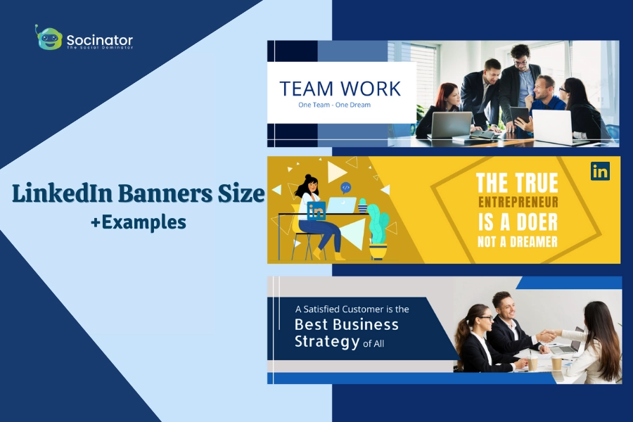
LinkedIn, the world’s largest professional networking site, puts a lot of emphasis on visuals to make your profile stand out. One crucial aspect of this visual appeal is the LinkedIn banner, an often overlooked but potent tool for personal branding.
In this blog, we’ll delve into the nuances of LinkedIn banner size, explore the best dimensions for various types of content, and even touch on tools like Socinator for seamless LinkedIn automation.
So, lets jump in!
Listen To The Blog Now!
5 LinkedIn Ads Banner Sizes
Medium Rectangle
Starting with the Medium Rectangle banner size, this versatile format measures 300 x 250 pixels. It’s an excellent choice for promotional content, showcasing products, or highlighting specific achievements. Create and optimize your LinkedIn business page to ensure its compact size doesn’t overpower your profile but still manages to grab attention effectively.
Leaderboard
If you’re looking for a larger, more impactful display, then the size of your Leaderboard banner will work for you. With a resolution of 728×90 pixels, it’s the perfect size for your professional brand to stand out and make a statement. Use this space to feature compelling visuals or key messages that set you apart from the crowd.
Large Rectangle
The Large Rectangle banner, sized 336 x 280 pixels, offers ample space for creativity. Whether you want to display a portfolio of your work or share testimonials, this format allows you to make a strong visual statement. Its generous dimensions make it an ideal canvas for showcasing your professional journey.
Sponsored Content
When engaging your network with sponsored content, consider the recommended LinkedIn banner size of 1200 x 627 pixels. This format seamlessly integrates with the LinkedIn feed, ensuring your promotional material appears seamlessly as users scroll through their updates.
Sponsored InMail
If you’re looking for an eye-catching banner that will stand out from the crowd, look no further than the 300 x 250 px ‘sponsored’ InMail banner. This site strikes the right balance, making your content visually appealing without overwhelming the recipient.
What is LinkedIn Story Size?
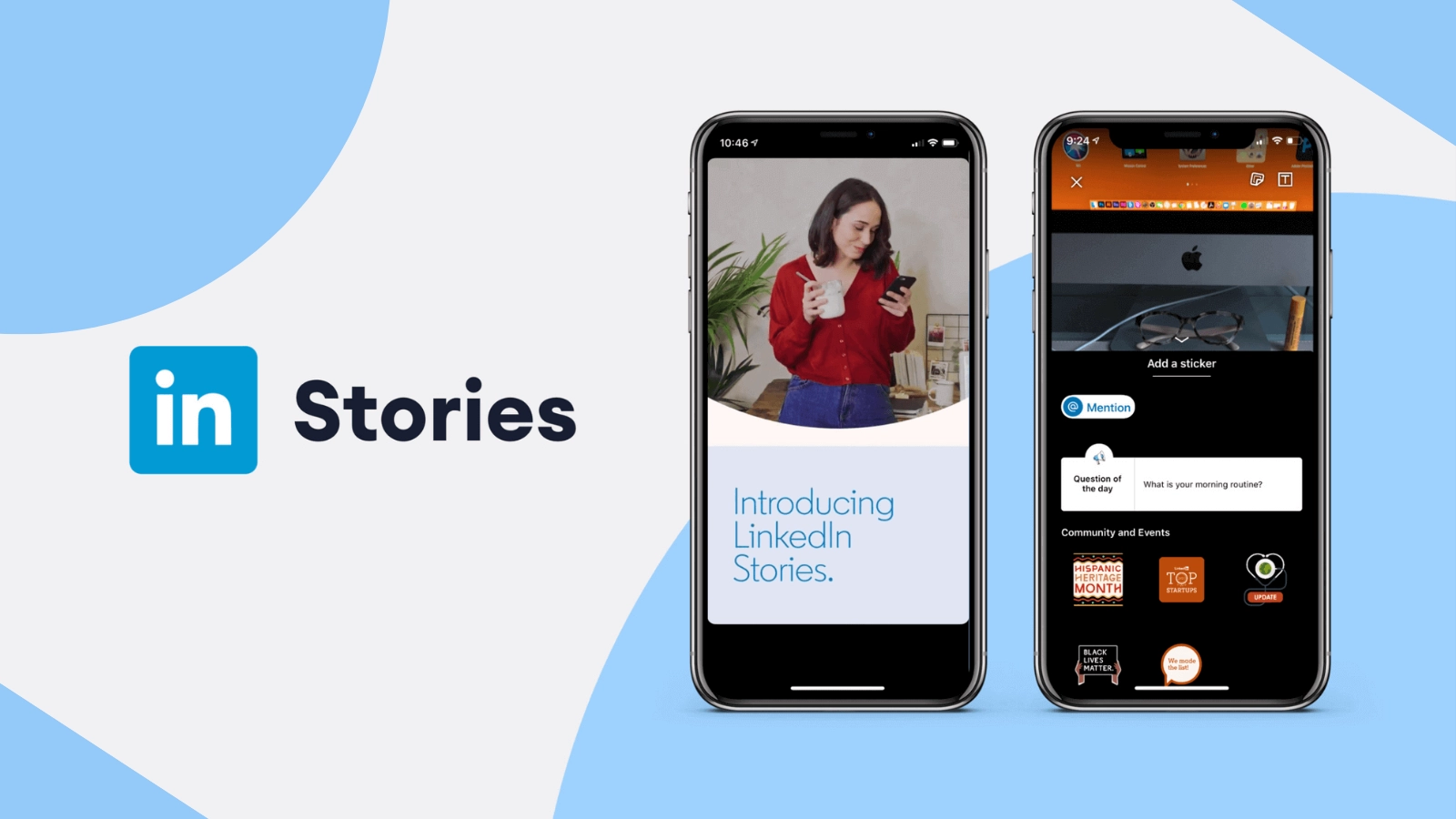
LinkedIn Stories have become an integral part of the platform, offering users a dynamic way to share updates and connect with their professional networks. As you embark on utilizing LinkedIn Stories to enhance your online presence, understanding the optimal dimensions for these stories is key.
LinkedIn recommends a standard LinkedIn Story size of 1080 x 1920 pixels. This vertical format is optimized to fit on the full screen of your mobile device, giving you an immersive and eye-catching experience. The aspect ratio of 9:16 makes it easy for your stories to slide right into the mobile experience and grab your audience’s attention.
Desktop Vs. Mobile: Banner
Navigating the nuances of LinkedIn banner dimensions is crucial for ensuring your professional profile looks polished and visually appealing across various devices. Let’s delve into the specifics of banner sizes on desktop versus mobile, understanding the dimensions that will optimize your online presence.
Linkedin Banner Size for Desktop: 1584 x 396 pixels
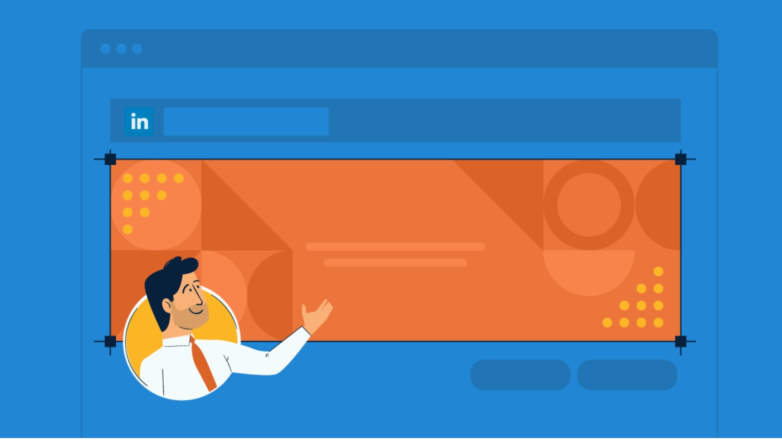
When crafting your LinkedIn banner for desktop viewing, the recommended size is 1584 x 396 pixels. This wide, horizontal canvas spans the top of your profile, providing ample space to showcase your brand visually.
Here’s why this size is essential for the desktop experience:
Prominence: The desktop banner is one of the first elements visitors see when landing on your profile. The larger dimensions ensure your banner commands attention and makes a lasting first impression.
Detailed Imagery: With more horizontal space, you can incorporate detailed imagery, such as panoramic shots, team photos, or intricate brand visuals. This allows for a more comprehensive representation of your professional identity.
Brand Storytelling: Utilize the desktop banner space to tell a visual story about your professional journey. Whether it’s highlighting key achievements, showcasing your workspace, or featuring your team, this size enables you to convey a narrative effectively.
Linkedin Banner Size for Mobile: 1080 x 360 pixels
Mobile devices present a different viewing experience, and the LinkedIn banner adapts accordingly with a size of 1080 x 360 pixels. The mobile banner appears more condensed, fitting the smaller screens of smartphones.
Here’s why this size is crucial for mobile optimization:
Responsive Design: The smaller dimensions cater to the limited screen real estate on mobile devices, ensuring your banner remains fully visible without overwhelming the interface.
Efficient Loading: Smaller file sizes associated with the 1080 x 360-pixel dimensions contribute to quicker loading times on mobile devices. This is vital for providing a seamless user experience, especially for users on slower internet connections.
Consistent Aesthetics: Even with less space, it is still important to maintain a unified visual identity. The mobile banner should align with the desktop version to ensure brand consistency and recognition across devices.
Understanding the distinctions between LinkedIn banner size on desktop and mobile is essential for creating a profile that captivates visitors, regardless of the device they use. By optimizing your banner dimensions and content, you can make a memorable impression and reinforce your professional identity on the LinkedIn platform.
In the pursuit of a successful LinkedIn approach, LinkedIn automation tools such as Socinator can make a difference. It streamlines your LinkedIn activities, from content sharing to connection requests, making your presence felt in a targeted and efficient manner.
Socinator| Advance Social Management Tool
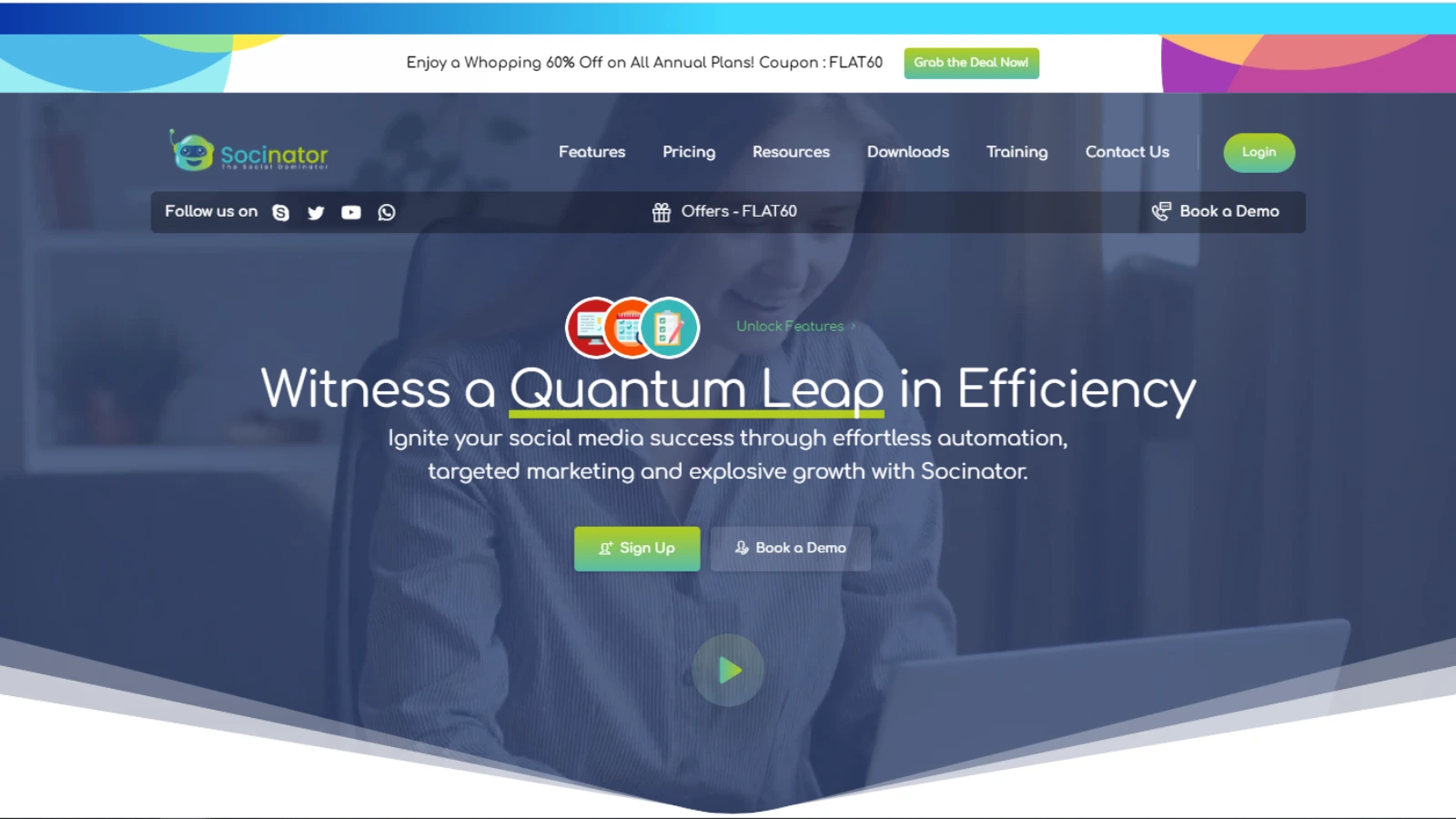 Socinator is a social media management tool that allows users to manage and grow all their social accounts safely and organically. It offers a comprehensive suite of tools, including social media scheduling, content management, audience targeting, analytics and insights, automation tools, and account security.
Social media scheduling:
Socinator allows users to schedule posts on multiple social media platforms, including Facebook, Instagram, Twitter, LinkedIn, Quora, YouTube, Pinterest, and Reddit. This feature allows you to schedule and publish content ahead of time, keeping your social media accounts fresh and active.
Social media automation:
Socinator offers various automation tools, such as auto-liking, auto-commenting, auto-following, and auto-sharing, which help users grow their social media presence organically and safely. This feature saves time and effort while boosting the channel’s presence.
Social media analytics:
Socinator provides in-depth analytics and reports, including user insights about every post and audience-related engagement and gains. This feature helps users to track their social media performance and make data-driven decisions.
Bulk management:
Socinator allows users to manage multiple social media accounts from a single place, making it easier for teams to collaborate and work together. This feature helps businesses to streamline their social media management process and improve their team’s productivity.
Account security:
Socinator offers various security features, such as proxy support and spin syntax support, which help users safeguard their online privacy and optimize their content. This feature ensures that users’ social media accounts remain safe and secure from any potential threats.
By using this Social media automation tool you can easily automate your marketing without worrying about manual social engagement.
5 Things to Consider While Picking the Right Banner Size
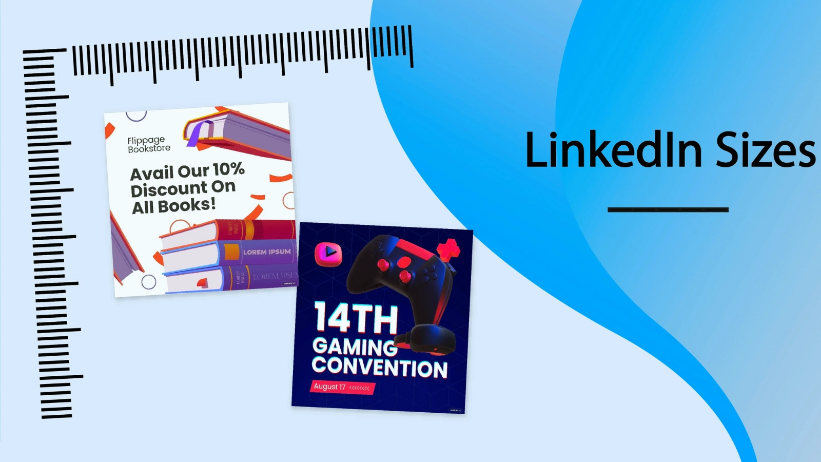 Crafting an impressive LinkedIn banner involves more than just selecting a random image and uploading it to your profile. The dimensions play a crucial role in how your banner appears to others. Here are five essential considerations for picking the right LinkedIn banner size:
1. Content and Purpose
Before settling on a size, consider the content you intend to showcase and the purpose of your LinkedIn banner. Different dimensions work better for specific types of content. If you’re focusing on professional accomplishments, you might want to consider a bigger banner for more detailed images. For concise branding messages, a more compact size could be effective.
2. High-Quality Imagery
Regardless of the LinkedIn banner size you choose, prioritize high-quality imagery. Blurry or pixelated images can detract from the professionalism of your profile. Not only do high-resolution images look more attractive, but they also speak to your attention to detail and dedication to quality.
3. Brand Consistency
Maintaining a consistent brand image across all your professional platforms is crucial. Your LinkedIn marketing banner should align with your overall brand aesthetics, including color schemes, fonts, and messaging. Consistency enhances brand recognition and reinforces your professional identity.
4. Mobile Responsiveness
With a significant portion of LinkedIn users accessing the platform via mobile devices, it’s essential to prioritize mobile responsiveness. Ensure that your chosen LinkedIn banner size looks appealing and remains impactful on smaller screens. A banner that’s too big might not look as good on your phone.
5. Update Regularly
Your LinkedIn banner is not a static element. Regularly update it to reflect your current professional endeavors, achievements, or any relevant changes. An outdated banner might convey a lack of engagement, while a refreshed banner showcases your current activities and keeps your profile vibrant.
By considering these five factors, you can pick the right LinkedIn banner size for your LinkedIn banner that aligns with your content, showcases high-quality imagery, maintains brand consistency, ensures mobile responsiveness, and stays current with your professional journey. Remember, your LinkedIn banner is a visual representation of your brand, so investing time and thought into its selection can significantly enhance your online presence.
Read More:
Create And Optimize Your LinkedIn Business Page: A Step By Step Guide
05 LinkedIn Marketing Tips To Improve Your Strategy
LinkedIn: The Modernistic Marketing & Lead Generation Tool
2 LinkedIn Banner Examples
Shopify
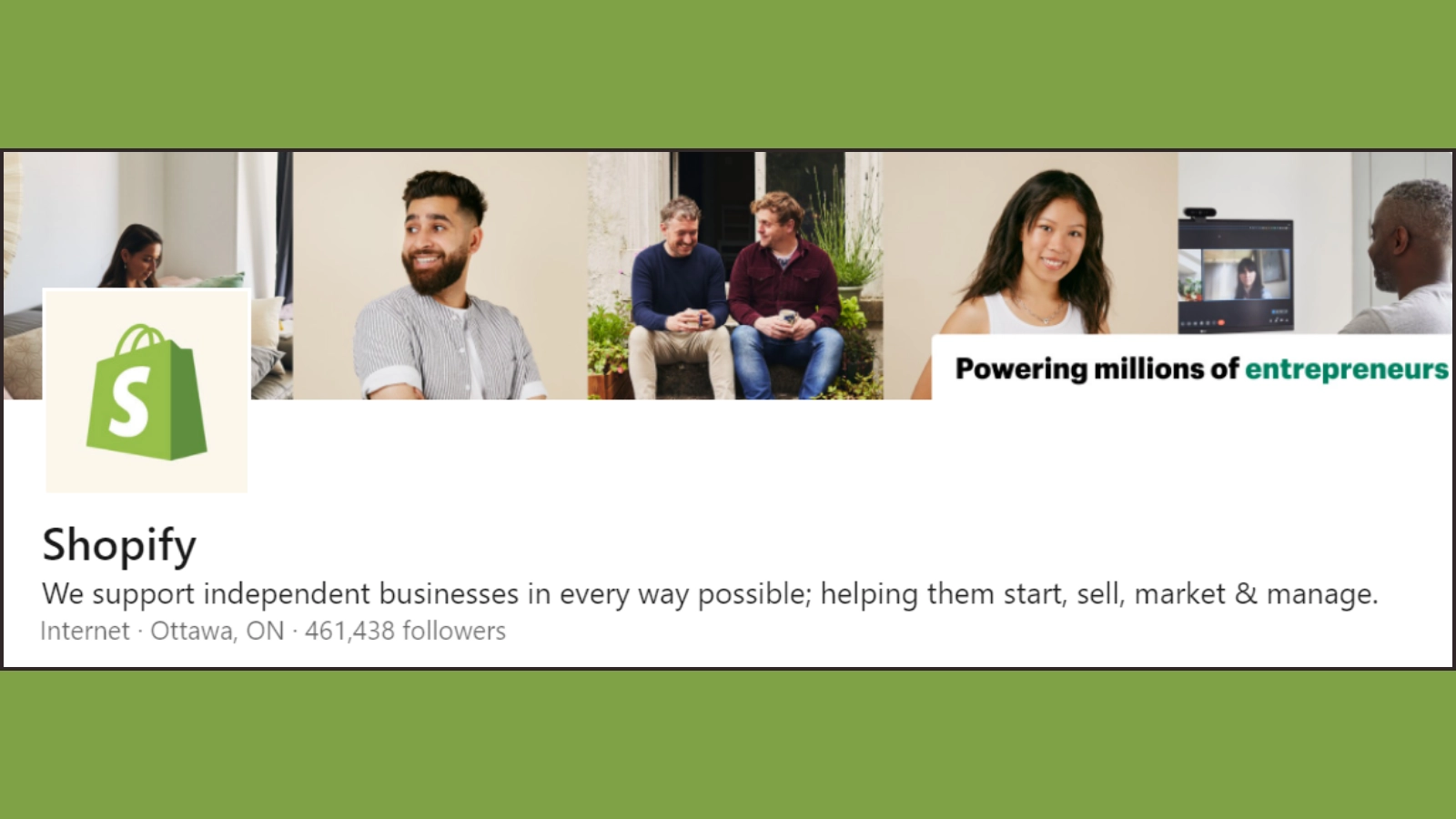
Shopify’s banner, strategically utilizing an impactful size, visually echoes its mission to empower millions of entrepreneurs. The deliberate choice conveys inclusivity and enables rich storytelling, capturing the essence of Shopify’s commitment to fostering diverse expertise within its entrepreneurial community.
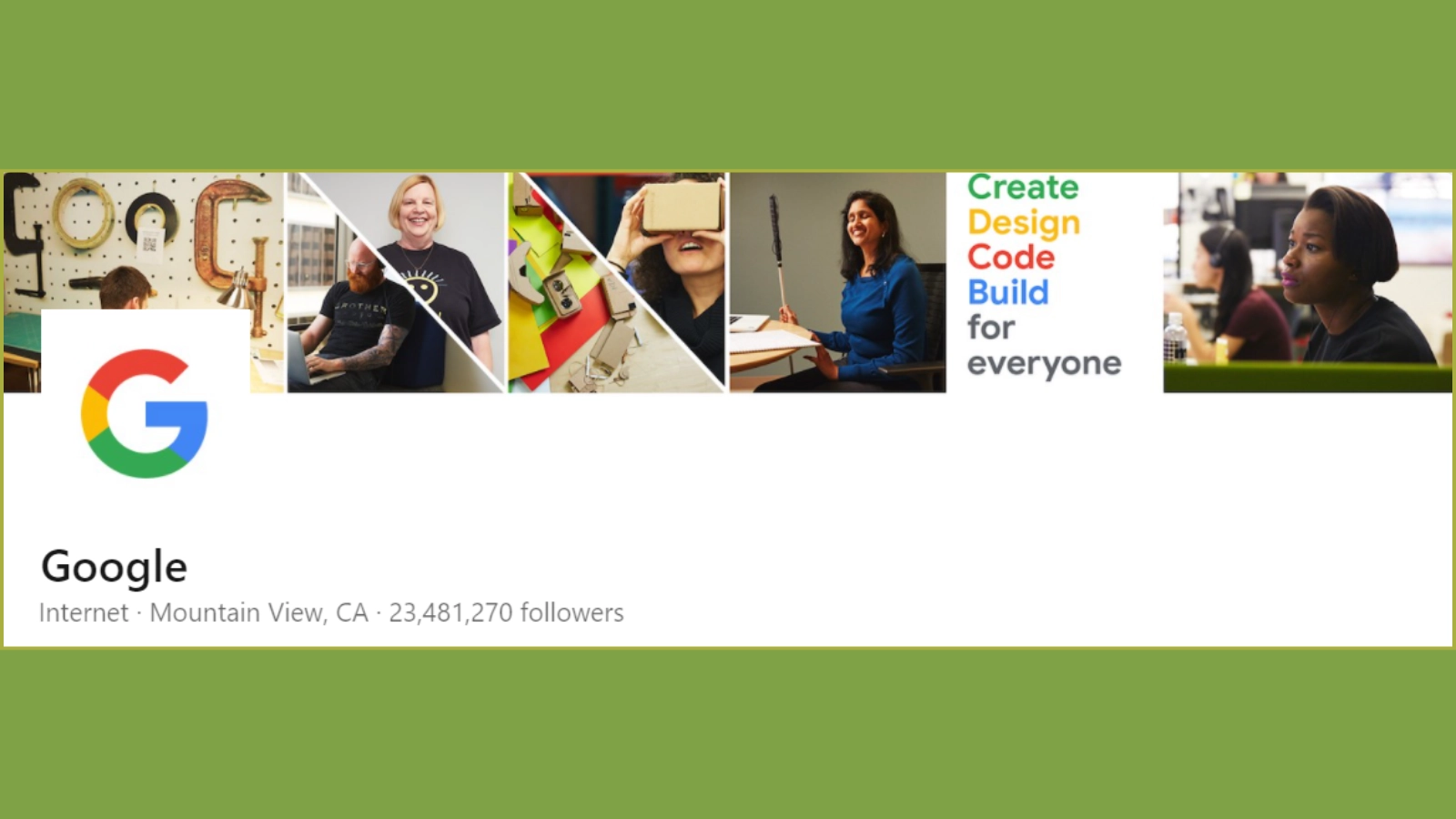
Google effectively conveys its team’s hard work and dedication through a carefully chosen image with a substantial banner size. This larger format enhances visibility, allowing for a detailed and impactful representation of the team’s commitment, innovation, and collaborative spirit, reinforcing Google’s dedication to excellence.
Let’s Wrap!!
In the world of professional networking, a well-crafted LinkedIn profile is your virtual business card. With so many different sizes and uses, the LinkedIn banner is one of the most effective ways to increase your online visibility.
By understanding the best dimensions for LinkedIn banner content types and platforms, utilizing LinkedIn marketing tools like Socinator, and considering key factors in size selection, you can create a compelling and visually appealing LinkedIn profile that sets you apart in the professional landscape.
Elevate your LinkedIn game by optimizing your LinkedIn banner size and making a lasting impression on your network.

