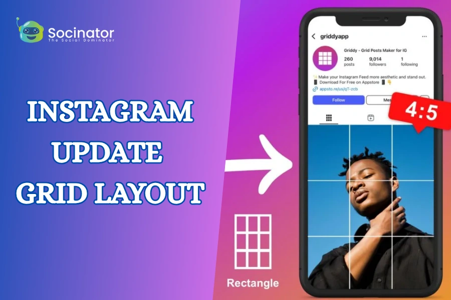
Instagram is always evolving, and its latest update, the redesigned Instagram update grid layout, is making waves among users, creators, and marketers. This subtle yet impactful shift in how posts are displayed on your profile can change the way your audience sees and engages with your content.
Let’s break it down with simple, smart, and user-friendly tips to help you stay ahead of the curve.
Hit ‘Play’ Button & Tune Into The Blog!
Why Did Instagram Change The Grid?
Instagram is always on the move, and this grid update is part of its mission to enhance the platform’s overall look, feel, and function. The Instagram update grid layout wasn’t just a cosmetic tweak; it’s a strategic shift aimed at aligning with how users consume and create content today.
So, why the change?
- A Cleaner, More Modern Aesthetic
The new grid offers a sleeker and more streamlined visual experience. It reduces clutter, improves spacing, and puts more focus on individual posts. This allows content to shine, especially visually rich posts and videos that benefit from a more open and balanced layout. - Reels And Videos Take Center Stage
Instagram is no longer just a photo-sharing app. With the rise of short-form videos and the growing popularity of Reels, Instagram needed a layout that supports motion content more effectively. This update gives video formats more prominence and better alignment, making them more engaging within the grid. - Improved Content Discovery And Engagement
A more optimized grid helps users browse through content faster and more intuitively. For brands and creators, this means better opportunities to catch attention and drive engagement, without relying on users scrolling endlessly. - Mobile-First Optimization
With over 98% of users accessing Instagram via mobile devices, the update also ensures a smoother and more responsive layout across all screen sizes. The grid now adapts better to mobile viewing habits, making sure your content is easy to navigate on the go. - Shifting Towards Dynamic Storytelling
Instagram’s algorithm is favoring dynamic content like Reels, stories, and carousels. This grid change is part of that evolution, encouraging users to think beyond static images and embrace more movement, interaction, and storytelling.
Understanding The New Instagram Grid
Instagram’s latest grid update has changed the way posts appear on your profile, and while it may seem subtle at first, the impact is significant.
Previously, your grid followed a strict square format where every post fit neatly into its designated spot. Creators could easily plan their feed with tools and preview apps, knowing exactly how each image would appear. But now? That predictability is gone.
With the new Instagram grid layout, thumbnails, especially for Reels and videos, are rendered differently. Some appear larger, others are cropped uniquely based on the type of content and even the device being used to view it. What looked aligned and balanced in your planner might show up slightly off-center or mismatched on your profile.
Here’s what you need to keep in mind:
- Reels Get Priority: Reels thumbnails often appear bolder or take up more visual space than regular posts, pulling attention and possibly disrupting your planned grid symmetry.
- Cropping Can Vary: Images and videos may be cropped differently depending on how Instagram formats them, especially for mobile versus desktop views.
- Not everything follows the perfect square format anymore: meaning your meticulously planned 3×3 layouts or checkerboard patterns might appear misaligned if not properly tested.
- Preview, Test, And Adapt: Now more than ever, creators should preview posts in context using updated grid planning tools or by saving them as drafts first. It’s the best way to spot any unexpected shifts before publishing.
How To Adapt to Instagram’s New Grid Layout?
When it comes to the Instagram update grid layout, the smartest move is to embrace adaptability. Instead of fighting the change, lean into it. Understanding how the grid behaves across different content types and devices is now a crucial part of creating a profile that looks cohesive and professional.
So, how can you stay ahead of the curve? Try these actionable tips:
-
Center Your Subjects
Keep the focus of your images and videos centered. This reduces the risk of important elements getting cropped out or misaligned, especially for Reels and portrait-format visuals.
-
Use Updated Grid Preview Tools
Rely on tools that mirror Instagram’s current grid format (not outdated versions). This helps you visualize how your feed will appear once posts go live, so there are fewer surprises and less frustration.
-
Think In Modular Design (Rows & Columns)
Create content that works well both individually and as part of a larger layout. Design your posts so that each row or column can stand strong visually, even if spacing or cropping shifts slightly.
-
Design For Multi-Device Display
Instagram layouts can look different across screen sizes. Professional creators now plan for slight variations between mobile, tablet, and desktop views. The goal isn’t to create a “perfect” feed; it’s to maintain visual clarity and aesthetic consistency regardless of how the content is viewed.
-
Shift From Perfection To Strategy
Perfection isn’t the priority anymore. What truly matters is a strong brand identity built through consistent colors, themes, and messaging. A minor misalignment won’t hurt if your overall visual narrative is engaging and cohesive.
Can You Change The Instagram Grid Back To Square?
One of the most common questions users ask after the Instagram grid update is:
“How do I change the Instagram grid back to square?”
The honest answer? You can’t.
Instagram currently does not offer a way to revert to the old square-only grid layout. There’s no toggle or setting to switch between classic and updated formats. But don’t worry, there are still ways to keep your feed looking sharp and aligned, even with the changes.
Here’s what you can do:
- Stick to Square Image Design
You can still create and upload square images (1080×1080 px). Even though Instagram may crop or display them differently on various devices or post types, designing with a square focus gives you the most control over layout.
-
Use Scheduling & Preview Tools
Apps like UNUM, Planoly, Later, or Preview allow you to pre-plan your posts in a grid format. These tools mirror how your feed will appear once published, so you can adjust and align before posting anything live.
- Design with the Grid in Mind
If your brand relies on symmetry and square precision, build all your visuals around a square-centric core, even if Instagram displays elements slightly differently. This way, you maintain a clean, professional, and recognizable brand aesthetic.
Read More!
10 Stunning Instagram Grid Templates To Attract More Followers
05 New Instagram Updates To Ignite Your Marketing Strategies
Leveraging The Grid Layout For Marketing?
For businesses, influencers, and creators, the Instagram update grid layout isn’t just a change; it’s a creative opportunity. The new design opens the door to fresh, eye-catching marketing strategies that make your profile stand out and tell a more compelling visual story.
Here’s how to turn the new grid into a powerful marketing tool:
Create Carousel Rows That Tell a Story
Design carousel posts where each slide continues a visual or message across a single row. This encourages users to swipe through and engage with your full story, increasing time spent on your content and boosting algorithm visibility.
Post Reels With Grid-Friendly Covers
Reels now play a more prominent role in your grid. Make the most of it by designing custom cover images that seamlessly blend into your feed’s aesthetic. A well-designed cover can maintain visual harmony and help your Reels stand out without disrupting your layout.
Build Puzzle Grids or Vertical Columns
Puzzle feeds, where multiple posts form one large image or message, are great for product launches, brand storytelling, or announcements. You can also create visually themed columns (like tips, testimonials, and products) to bring structure and style to your feed.
Drive Clicks and Follows With Strategic Visuals
Since your grid is often the first thing users see when they visit your profile, treat it like a landing page. Use bold visuals, consistent colors, and intentional design to create a strong first impression that encourages profile exploration and follows.
Use Instagram Marketing Tools for Precision
Planning is key. Tools like Planoly, Later, UNUM, and Canva’s Instagram planner let you test layouts, align posts, and ensure consistency. These platforms help you stay on-brand while adapting to layout changes with ease.
Automate and Scale with Smart Tools
You don’t have to manage every post or layout adjustment manually. With the right Instagram marketing automation tools, adapting to the new grid layout becomes faster, easier, and far more efficient. There are such tools that can help you schedule posts so you can stay consistent, professional, and ahead of the curve.
Instagram automation software lets you:
- Schedule posts in advance with real-time grid previews
- Auto-publish content based on optimal engagement times
- Track performance metrics to understand how the new layout impacts visibility and interaction
Automation not only streamlines your workflow, it gives you back time to focus on what matters: strategy, creativity, and audience growth.
One powerful tool that stands out is Socinator.
Socinator simplifies your Instagram management with advanced automation features designed to scale your efforts. Whether you’re scheduling Reels, managing engagement, or tracking analytics, Socinator helps you stay consistent while keeping your content aligned with the new grid layout.
How Socinator Streamlines Instagram Automation?
If you’re navigating the changes introduced by Instagram’s new grid layout or simply seeking to enhance your social media strategy, Socinator is a powerful tool designed to simplify and scale your Instagram marketing efforts. It combines automation with smart insights, allowing you to stay in control while saving time.
Here’s how Socinator makes a difference:
Multi-Platform Scheduling
Plan and schedule your content not just for Instagram, but also for Facebook, Twitter, YouTube, LinkedIn, and more, all from one dashboard. Stay consistent and hit optimal posting times without lifting a finger.
Content Management Made Easy
Organize, queue, and manage your Instagram content from one place. Whether you’re handling single or multiple brand accounts, Socinator’s dashboard ensures seamless handling of images, captions, and publishing workflows, keeping your content strategy aligned and clutter-free.
Built-In Account Safety
Socinator uses advanced simulation techniques and secure login protocols that mimic real user behavior, reducing the risk of being flagged or banned by Instagram. Your account remains safe while benefiting from automation.
Advanced Automation Features
From auto-liking and commenting to smart following and messaging, Socinator’s automation tools handle routine engagement, allowing you to focus on high-level strategy. It’s growth on autopilot.
Built-In Account Safety
Worried about security? Socinator uses advanced activity simulation and secure login protocols to keep your accounts safe from bans or restrictions while automating responsibly.
Conclusion
The Instagram update grid layout is more than just a visual; it’s a signal that Instagram is evolving with content trends. Instead of seeing it as a roadblock, use it as a creative challenge.
With a flexible mindset and the right tools like Socinator, you can make the new grid work in your favor. Keep your feed clean, your content purposeful, and your automation smart.
Stay updated, stay adaptive, and let your Instagram strategy reflect the new era of digital storytelling.
FAQs
- What is the Instagram update grid layout?
The Instagram update grid layout changes how posts, Reels, and videos appear on your profile. It allows larger thumbnails and shifts how content is cropped or displayed to better highlight videos and improve visual flow. - Can I go back to the old Instagram grid layout?
No, Instagram does not allow switching to the old layout. However, you can still design square visuals and preview your grid using third-party layout tools like Planoly or UNUM. - Why did Instagram change the grid?
Instagram updated the grid to support dynamic content like Reels, improve the mobile user experience, and better align with how users engage with visual media. - How can businesses benefit from the new grid layout?
Brands can use the new Instagram update grid layout to tell visual stories, highlight campaigns, and improve user engagement by designing content rows or columns that flow better on the profile page. - What tools can help manage the Instagram grid layout effectively?
Automation tools like Socinator help you schedule posts, manage content, monitor performance, and keep your grid looking sharp and professional, even with layout changes.