Creating eye-catching YouTube thumbnails is crucial for boosting views and engagement. Yet, it can be tough to spark strong emotions in a broad audience. Many creators struggle with coming up with ideas and figuring out what makes a thumbnail stand out. That’s where analyzing top-performing YouTube thumbnail examples can really help.
Thumbnails are a major factor in whether viewers decide to click on a video. They’re essential for grabbing attention and driving sales—70% of people make purchases after seeing a brand on YouTube. Tapping into YouTube’s huge user base is key to expanding your reach.
To make a lasting impression, your thumbnails need to be both eye-catching and memorable. Let’s dive into the basics, explore different types, and look at some design ideas for creating compelling YouTube thumbnail examples.
Listen To The Podcast Now!
YouTube Thumbnails – What Are They?
A YouTube thumbnail is the first picture you see when looking at videos. A catchy image grabs our attention, while a dull one makes viewers lose interest. Thumbnails are like the cover of a book for your video, appearing in search results, on the homepage, or your channel.
When you upload a video, YouTube lets you choose a frame from it, but pause and think: is that frame exciting enough to make people want to watch? You can watch a few YouTube thumbnail examples to see which thumbnails attract more views and clicks.
You can also schedule uploading your video using Socinator at a particular time. That way, you can publish it at the exact time when most of your viewers are active on YouTube. After all, you spend much effort crafting a thumbnail for a video, and if you do not get the desired views due to time-related events, then it’s all a loss. Thus, scheduling your videos to be uploaded at a particular time can be highly profitable.
Socinator is a tool that can automate tasks like video posting, commenting, and replying to comments. With this tool, your social media platform feels lively and allows you to concentrate on other important tasks like content creation. Let us learn in brief about this beneficial tool.
Socinator- Simplify Your Social Media Management With The Power Of Automation.
 Socinator is a robust tool for managing social media. It helps make your online presence better by improving different aspects. Let’s explore some important features that make Socinator useful for social media lovers, marketers, and content makers.
Automated Posting:
Develop and publish engaging content on multiple social media platforms following a strategic schedule. Tailor posts to each platform’s audience, ensuring consistency in brand messaging and maximizing reach. Regularly analyze engagement metrics to refine future content and optimize posting times for better audience interaction and growth.
Growth Tools:
Boost audience engagement and grow your following by automating key social media interactions, such as following and unfollowing users, liking posts, and leaving thoughtful comments. Utilize automation tools to streamline these activities, ensuring consistent and timely engagement while maintaining a personal touch to build a loyal and active community.
Analytics:
Evaluate the success of your social media campaigns by utilizing comprehensive analytics and generating detailed reports. Track key performance indicators (KPIs) such as reach, engagement, conversion rates, and follower growth. Use these insights to identify trends, adjust strategies, and make data-driven decisions to enhance future campaign effectiveness and achieve your marketing goals.
Customization:
Tailor your automation settings to align with your specific requirements and preferences. Adjust parameters for following, unfollowing, liking, and commenting to match your brand’s voice and target audience. This customization ensures that automated actions remain relevant and effective, fostering genuine engagement and maximizing the impact of your social media efforts.
Socinator empowers businesses and marketers to save time, increase efficiency, and achieve greater success in their social media marketing endeavors.
The main aim of a thumbnail is to get as many clicks as possible. You want to attract viewers to watch your content and then explore more of what you offer. To achieve this, there are some guidelines you need to follow to make your thumbnails effective.
They are:
- Correctly show what the video is about
- Get viewers excited for the video
- Spark viewers’ curiosity
- Use empty areas wisely
- Use pre-made thumbnail designs
You could consider these points as the guiding principles for a strategy. This approach captivates online visitors, leading to steady growth. The thumbnail needs to be thrilling and grab the audience’s attention to encourage them to watch videos and content. Learning from the best YouTube thumbnail examples can be beneficial.
Let us learn how to create thumbnails for YouTube and about some rules that you need to follow while creating YouTube Thumbnails.
Guidelines For YouTube Thumbnails:
YouTube has certain rules you need to follow when creating thumbnails. One of these is the YouTube thumbnail size. Here are some important tips for youtube thumbnails. Your thumbnail should:
- Be 1280 x 720 pixels in size.
- Have a 16:9 aspect ratio.
- Stay below 2MB in file size.
- Be in JPG, GIF, or PNG format.
Let us now dive into some of the best YouTube thumbnail examples along with its types.
Best YouTube Thumbnail Examples With Types
Just as there are various types of YouTube titles that attract clicks, there are also many different thumbnail designs. Here are eight of the most popular ones, along with the best YouTube thumbnail examples and explanations of why they’re effective.
Straightforward Statements In YouTube Thumbnail Examples:
 Putting a fact or strong opinion in your thumbnail’s text can reinforce your video title and grab attention. It is one of the best types of YouTube thumbnail examples that you can go for to make your audience more curious about your videos.
For example, The Futur’s thumbnail says “The client is not your enemy.” This makes viewers wonder why they should think differently about clients, especially if they’ve had disagreements before.
It gets them thinking and more likely to click on the video.
Comparing Past And Present Situations:
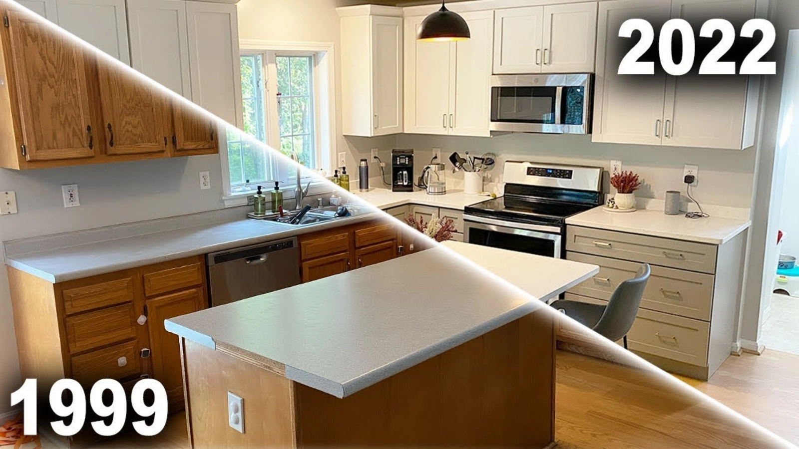 Before and after comparisons aren’t just fun to look at, they also have a practical use when you’re showing off your products or services. They show potential viewers and customers that they can achieve their desired result with your help.
The before and after from The Fixer is a good example of using transition to attract viewers among many YouTube thumbnail examples. It shows how outdated the image on the left is compared to the modern 2022 version. If someone has old kitchen cabinets, this would make them interested in seeing how they can be replaced and start to trust the creator’s advice.
Personal Experiences:
 This kind of YouTube thumbnail could show a look back or a typical day, focusing on successes or lessons learned. Sharing personal experiences can quickly make you seem reliable to potential viewers. They see that you’re not just pretending to be an expert to sell them something.
This makes viewers feel like you understand their problems or goals. Overthinker Apparel used this type of thumbnail to build trust. Using your own pictures instead of stock photos shows that you’re talking from real experience.
Also, notice the specific text like “How I started a clothing brand.” It grabs the attention of viewers who want to work from home or are unsure if they can succeed without experience. It is one of the best YouTube thumbnail examples that you can learn from.
Attention-Grabbing Phrases In YouTube Thumbnail Examples:
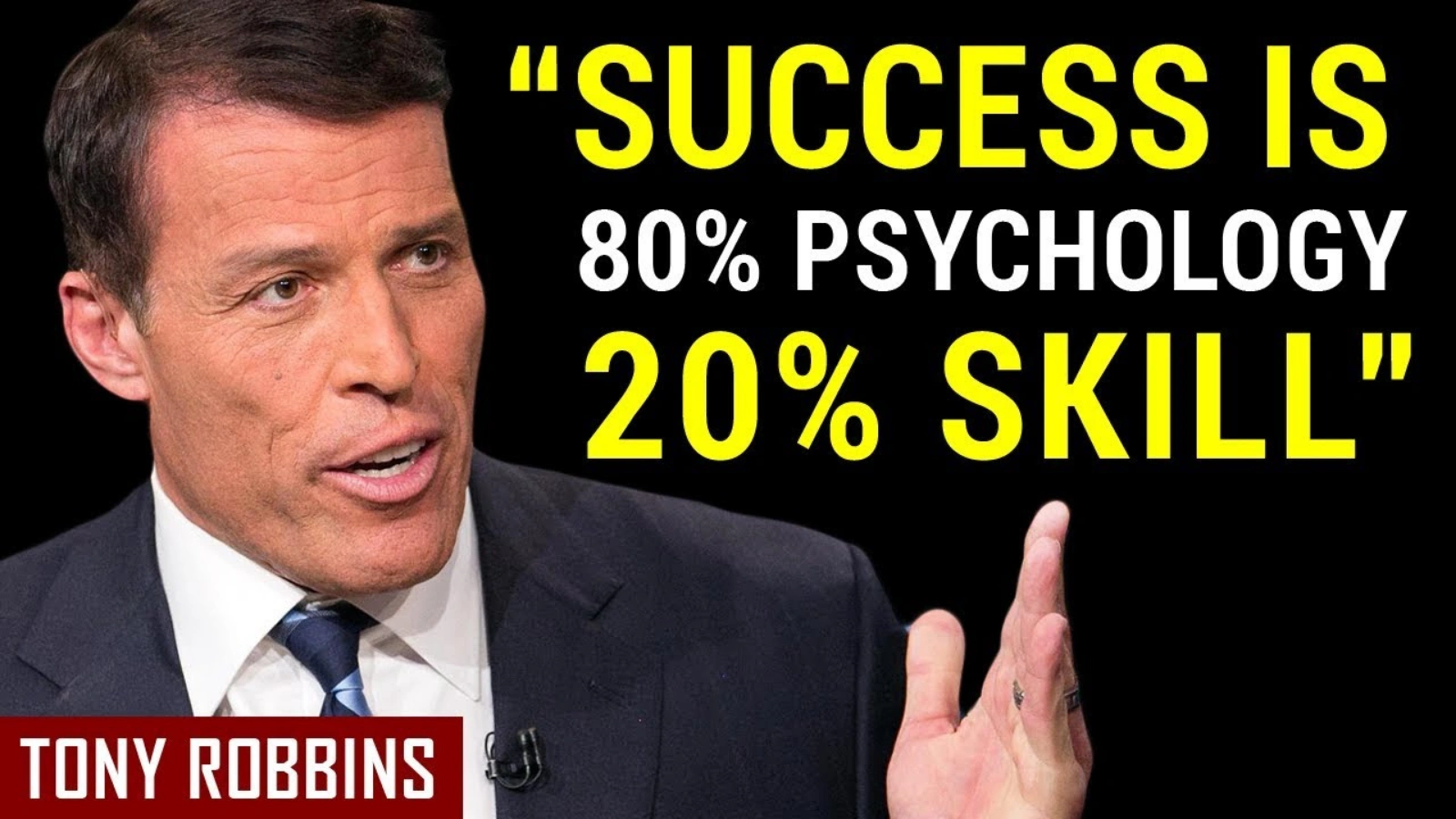 Quotes are really useful. They can get clicks by being shocking or confirming what people already think. They might say something controversial that viewers want to hear more about. Some quotes might make people realize they don’t know everything, while others might just give information.
The example from Motivation Madness could fit into a few of these categories. Also, if the quotes are from influencers, like in this case, it can make more people interested in your video.
Some people might disagree and want to hear why Tony said that, some might agree and find it interesting, and others might just want to understand it better before deciding. All three groups are likely to click because of it.
Comparisons Or This Vs. That Templates:
This type of thumbnail is useful for people trying to decide which video to watch. No need to make it complex. Just show clearly in the picture or text what two things you’re comparing, so viewers know it’s a comparison they’re interested in.
An example is the thumbnail from Neil Patel. The title and background picture clearly show the topic. Neil also looks like he’s thinking hard, which matches the topic of carefully comparing Google Ads and Facebook Ads. This is one of the many well performing YouTube thumbnail examples that can take inspiration from.
Presentations Of Products:
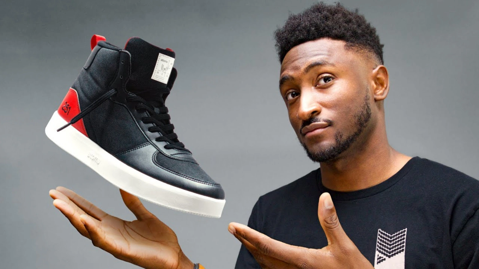 Launching a new product line or reviewing products? Then show them off! If you’re selling something, good photos of it will attract more customers. And if you’re doing a review, showing the items reinforces that your content is what people want.
For example, Marques Brownlee’s thumbnail of his new sneakers is a good example. Having Marques in the picture grabs attention, especially for his fans. Then the focus shifts to the sneaker itself with a simple background and no text.
Also Read:
YouTube Video Dimensions: 07 Marketing Strategies To Enhance Your Brand
Does YouTube Marketing Automation Work?
How To Increase YouTube Engagement Rate: 7 Ways That Work
Interesting And Engaging Inquiries:
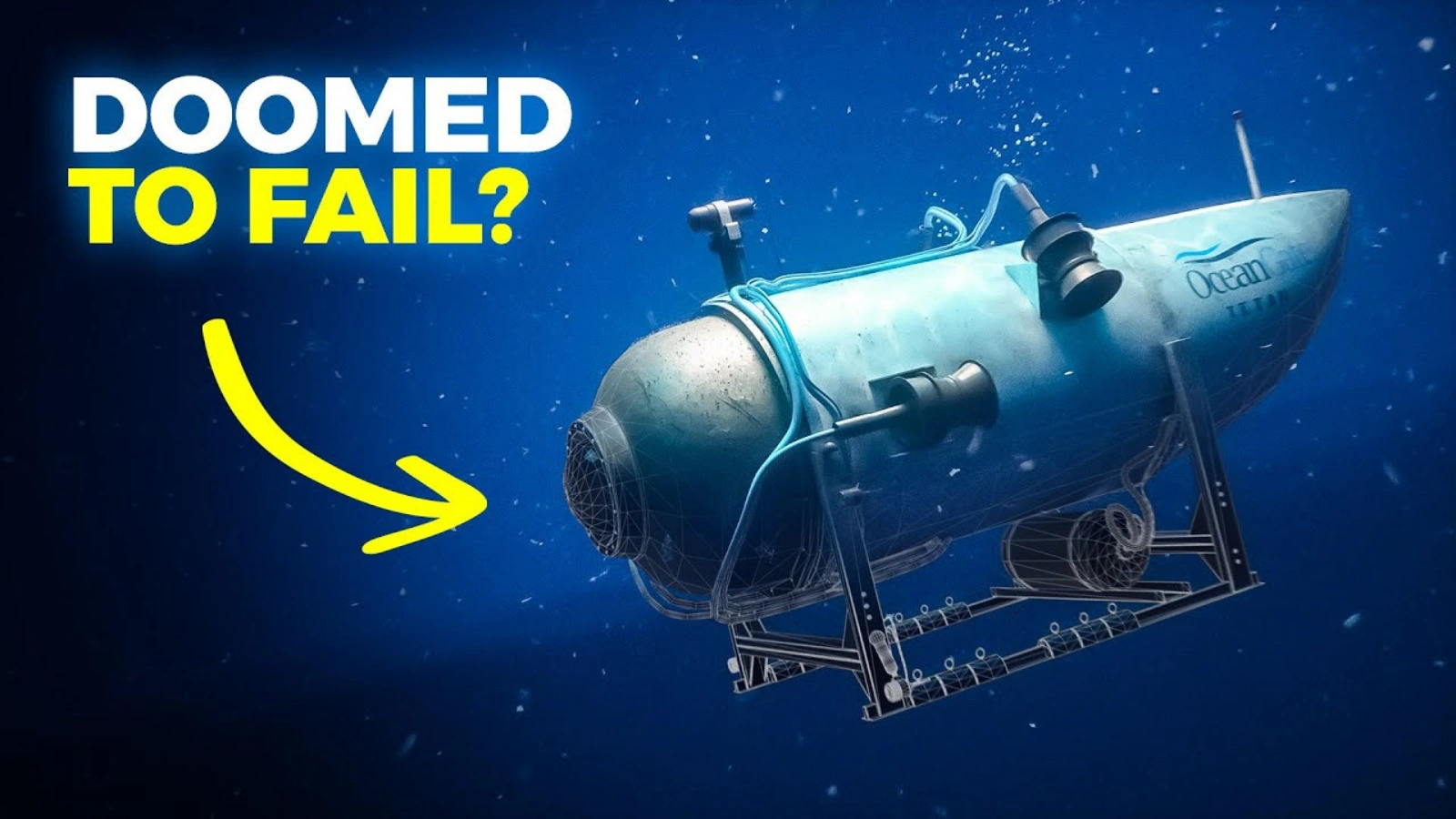 One of the best YouTube thumbnail examples is of the video thumbnail of Real Engineering in which they induce curiosity through questions. Questions are a great way to get people involved because they make you think. When you see a question, you naturally want to answer it in your head or think about whether it interests you. Try using questions that spark curiosity or make people think about their own experiences, especially emotional ones.
In the thumbnail from Real Engineering, they ask a direct question: “Doomed to Fail?” This thought-provoking inquiry encourages those acquainted with the Oceangate Titan incident to reassess their current understanding and ponder potential revelations of additional information. It also makes people who aren’t familiar with the situation curious about what went wrong.
Thumbnail Showing Steps Or Stages:
 In various content, especially videos, how-to and tutorial-style content is quite popular. Many people rely on YouTube to learn new things. One way to attract viewers to your videos instead of others on the same topic is by showing the process. This, along with your video title, assures viewers that your content contains the information they’re looking for.
For instance, consider this thumbnail from CCX Roofing Siding Gutters. This simple image suggests a step-by-step guide and also gives a sense of movement or action. Since viewers want practical information, this type of image is more engaging than a static picture of someone just posing on a roof.
With these eight YouTube thumbnail examples, we get to know how you can attract more clicks on your videos using different types of thumbnails.
Wrapping Up:
Crafting captivating YouTube thumbnails is essential for increasing views and engagement on your videos. By analyzing top YouTube thumbnail examples and understanding various types of YouTube thumbnail template, you can optimize your content for maximum impact.
Remembering key principles such as clarity, excitement, and relevance will guide you in creating effective thumbnails that compel viewers to click and explore your content further.
Leveraging tools like Socinator for scheduling and automating uploads ensures your videos are shared at optimal times, enhancing their visibility and reach. With thoughtful thumbnail design and strategic implementation, you can boost your presence on YouTube and drive success in your social media endeavors.


