Have you ever stumbled upon a LinkedIn profile that instantly grabs your attention? Do you wonder what the LinkedIn banner size is? Or, What is the architect behind curating it? If yes, let us assure you that you have landed at the right place at the right time.
LinkedIn banner is the digital storefront of your brand in professional networking. It’s not just the professional credentials or the catchy job title that captures your interest. Instead, it is the first thing visitors notice, creating an immediate impression that can either propel you into the spotlight or leave you blending into the background. With millions of professionals navigating the digital landscape, a well-curated LinkedIn banner is your opportunity to stand out in a sea of profiles, making a memorable first impression that lasts.
Today, on this blog, we will delve into the complexities of the size of a LinkedIn banner, how you can craft a perfect banner, the science behind the best banners, and more.
In a hurry? Listen to the blog instead!
Understand LinkedIn Banner Size
As we discussed, the LinkedIn banner is the visual cornerstone of your professional identity, and getting the correct dimensions is crucial for making a lasting impression.
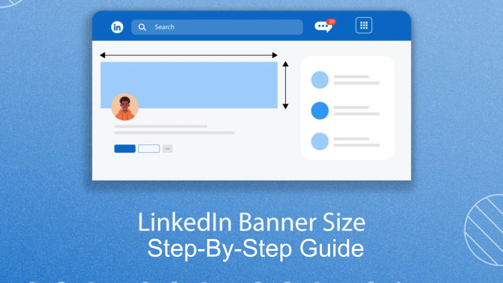
Utilize the ideal LinkedIn banner dimension of 1584 x 396 pixels to ensure your LinkedIn business page and profile stands out. Its optimal dimension guarantees that your banner spans across devices seamlessly, delivering a polished look to anyone visiting your profile.
Now, let’s unravel the technicalities. Pixels, the building blocks of digital images, play a pivotal role. Understanding the aspect ratio ideally 4:1 for LinkedIn banners, ensures your image appears balanced and visually appealing. Additionally, pay attention to file format. Use JPEG, PNG, or GIF. Each has its strengths, so choose based on your content.
Mastering LinkedIn banner dimensions is akin to setting the stage for your professional narrative.
Influence Of LinkedIn Banner Size
 A well-crafted LinkedIn banner is like the friendly handshake of your online profile—it speaks volumes about you before you even say a word. Imagine it as your personal brand’s visual ambassador. A visually appealing banner isn’t just about looking nice; it’s your chance to stand out and make a positive first impression in the professional world.
When your banner is on point, it enhances your professional brand by adding a touch of personality and style to your profile. Effective banners draw people in, making them more likely to connect and engage with your profile.
Take a moment to browse some profiles with eye-catching banners, and you’ll notice the impact. It’s like a well-decorated storefront that makes you want to step inside.
Design Principles for Eye-Catchy LinkedIn Banner
Following are the design principles for linked in banner size.
Simplicity is Key
Keep your LinkedIn banner size design clean and uncluttered. Avoid overwhelming visuals or excessive text that can distract from your professional message. A simple design ensures that viewers can quickly understand your brand without feeling visually overwhelmed.
Consistent Branding
Harmonize your Linkedin profile banner size design with your overall personal brand. Use a color palette, fonts, and imagery that align with the rest of your profile. Consistency reinforces your professional identity and helps with brand recognition, making your profile more memorable. You can also leverage social media automation tools like Socinator to maintain your consistent online presence.
High-Quality Imagery
Opt for high-resolution images to maintain a polished and professional look. Blurry or pixelated visuals can detract from the overall quality of your profile. Choose high-quality images that are relevant to your industry or your personal story.
Strategic Use of Color
Understand the psychological impact of colors and choose a color scheme that resonates with your brand and industry. Different colors evoke specific emotions and perceptions, so select hues that align with the professional image you want to convey. A well-chosen color palette adds visual appeal and reinforces your message in your Linkedin banner size.
By adhering to these design principles, you can create an eye-catching LinkedIn banner that can help you elevate your professional presence.
Step-by-Step Guide To Create LinkedIn Banner Size
Follow the below steps to create an impactful Linkedin banner
1. Choose a Relevant Image
Start by selecting a high-resolution image that aligns with your professional identity. It could be a professional photo, a snapshot of your workspace, or an image reflecting your industry. Ensure it resonates with your brand.
2. Resize to LinkedIn Dimensions
Understand LinkedIn’s recommended banner size (1584 x 396 pixels). Use simple online tools or graphic software to resize and crop your image accordingly. This step ensures your banner looks polished and fits seamlessly on all devices.
3. Select a Cohesive Color Palette
Opt for a color scheme that complements the linkedin banner size of your brand. Consider colors associated with your industry and those that convey the right emotions. Keep it simple and cohesive to maintain a professional appearance.
4. Incorporate Readable Text
Use clear and legible font to add your name, a professional headline, or a brief tagline. Ensure the text contrasts well with the background for optimal readability. Strike a balance between information and design.
5. Achieve Visual Balance
Maintain a harmonious balance between text and images. Avoid overcrowding by strategically placing elements on your banner. Ensure a clean and organized layout that guides the viewer’s eye naturally.
6. Personalize with Graphics or Icons
Enhance your banner with subtle graphics or icons that align with your professional narrative. These could represent your skills, industry, or interests. Make sure they complement the overall Linkedin banner size design without overwhelming the banner.
7. Upload and Preview
Head to your LinkedIn profile, click “Add profile section,” and select “Featured.” Upload your curated banner and use the alignment tools to ensure it displays optimally. Preview it on desktop and mobile views to guarantee a seamless user experience.
Learn how to make your LinkedIn banner look amazing in just seven steps. It will help you introduce yourself professionally and leave a great impression on people who visit your profile. For maintaining the online presence and optimize their LinkedIn profile, marketers and brand use LinkedIn automation tool like Socinator.
Socinator- Social Media Marketing & Automation Tool
Socinator is a social media marketing and automation tool designed to help users manage and grow their presence on various social media platforms, including LinkedIn. It assists marketers and brands in automating their social media tasks, providing a comprehensive solution for LinkedIn marketing and more.
Here are some key features of Socinator:
Multiple Social Media Platforms
Socinator supports popular social media platforms, more than 10 platforms including Facebook, Instagram, Twitter, LinkedIn, Pinterest, YouTube, and Quora.
Automation Tasks
Users can automate various tasks with the software, such as posting content, liking, commenting, following, and unfollowing, saving them time and streamlining their social media management. Such features can help you streamline your Linkedin account activities..
Scheduling
Socinator answers the most common question for working professionals: can you schedule posts on LinkedIn?
The software helps marketers schedule posts at specific times, ensuring a consistent and timely presence on social media without manual intervention.
Advanced Targeting
Users can implement advanced targeting criteria for their automation activities, helping to reach a more specific and relevant audience.
Account Management
The tool provides features for managing multiple social media accounts from a single dashboard, making it convenient for individuals or businesses with a presence on various platforms.
Reports and Analytics
Users can access insights and analytics to track the performance of their social media activities, allowing for data-driven decision-making and optimization.
User-Friendly Interface
Socinator is designed with a user-friendly interface, making it accessible for beginners and experienced social media marketers.
Therefore, Socinator is a social media automation tool designed to help marketers and brands streamline their social media activities and profile optimization.
Read More
LinkedIn Marketing: 05 Reasons Unlock Your Professional Potential
How Can You Schedule Posts On Linkedin Like A Pro?
Create And Optimize Your LinkedIn Business Page: A Step By Step Guide
Common Mistakes To Avoid
Avoiding common mistakes is crucial when curating your LinkedIn banner size to ensure it effectively communicates your professional brand. Here are some common mistakes to steer clear of:
Overcrowding and Clutter
Resist the temptation to include too much information or too many elements in your banner. A cluttered design can be overwhelming and distract from your key message.
Inappropriate or Unprofessional Visuals
Choose visuals that align with your professional identity. Avoid using images or graphics that may be perceived as unprofessional or unrelated to your industry.
Ignoring Mobile Viewing Experience
Many users access LinkedIn from mobile devices. Ensure your Linkedin banner size looks impressive and is appropriate on smaller screens by checking its appearance on various devices before finalizing.
Poor Image Quality
Opt for high-resolution images to maintain a polished look. Blurry or pixelated visuals can detract from the professionalism of your profile.
Neglecting LinkedIn Banner Dimension
LinkedIn provides specific dimensions for banners (1584 x 396 pixels). Failing to adhere to these dimensions may result in your banner not displaying optimally on various devices.
By steering clear of these common mistakes, you can ensure that your LinkedIn banner effectively communicates your professional identity, leaving a positive and lasting impression on those who visit your profile.
Are You Able To Create An Eye-Catchy LinkedIn Banner?
LinkedIn profile stands as a digital testament in the journey of your professional networking landscape. As we conclude this exploration into the art of curating an impactful LinkedIn banner, remember: it’s not just an image but a narrative in pixels.
The careful consideration of LinkedIn banner size, design principles, and personal branding we discussed isn’t merely a guideline—it’s your opportunity to tell a compelling story. So, seize the moment, revisit your LinkedIn banner, and infuse it with the energy of your evolving career.
In this digital realm, craft deliberately, tell your story boldly, and let your LinkedIn banner shine as the visual signature of your thriving professional narrative.

