How can you stand out among the millions of individuals that use Twitter every day? The answer is as easy as apple pie – promising design.
If you take Twitter seriously, it’s high time you should take Twitter banner image seriously too. And a massive (literally!) part of that image is the Twitter header picture. The Twitter header is the most perceivable part of your Twitter profile and is well worth your time.
Even though Twitter has set guidelines for header photo size, getting the dimensions just right is still insanely tough. That is because, even if you meet the recommended criteria, the Twitter dimensions header has a weird habit of chopping off a portion of your cover photo.
So is there any solution to avoid this situation? Well! That, my friend- is why I am here with this fun blog to help you create and remodel your header image that will win customers.
It is now time to be inspired and creative! And to help you tap into that extra creativity, we have put up a list of 5 ideas for designing a beautiful header that accurately represents your company.
Twitter’s guidelines for header photos
How about having a look at a few guidelines of Twitter & a mini-guide for header images before we hop onto some optimization tactics. Because only if we know the basics- we can ace the game.
- The optimal Twitter header size is 1500px by 500px.
- Each gadget has a different display size, but they all have a 3:1 aspect ratio. 1500×500 still works. Keep any crucial content towards the middle of your header photo to avoid cropping from the top and bottom of 60px.
- Photos can be in any format: JPG, GIF, or PNG. (Twitter does not support animated GIFs for profile or header images.)
- Twitter advises that profile pictures and banner images have file sizes of less than 2MB.
- Remember that your profile photo will block part of your header in the lower-left corner, so do not put anything important there.
Here’s the problem…
Even if you stick to these Twitter header dimensions, your header picture may not appear right after publishing it. These dimensions will not suddenly make your Twitter banner seem beautiful. However, even if we can not fix a few flaws, there is still hope. We can optimize our Twitter header image in such a way that the final result emerges as a winner.
To know how? Keep reading this blog to know how to make a header for Twitter.
Tips To Craft a Perfect Twitter Header Image
Pick an image that represents your brand.
Imagine picking an image full of fashion, but your brand focuses on technologies. Does it make any point? Therefore, have a brainstorming session to choose the image you want your business to convey. Because your header picture serves as a representation of your company. You should make sure the image you pick totally fits your overall branding. Either you add the brand logo to the image or choose a color that is the hook color of your brand.
Another aspect to think about is your target audience. What type of image would be most appealing to the audience? Are you attempting to project a lighthearted, professional, or family-friendly image?
Feature high-quality images
Your Twitter header photo will serve as a gateway for new users. Therefore, we need to focus on two main elements.
- Pique the interest of another Twitter user
- Work with little and big amounts of information that is easily understood.
Selecting a high-quality image or artwork with powerful imagery and color is the best approach to accomplish these goals. Twitter compresses header pictures (after converting them to JPG) via JPEG compression, which might degrade image quality. Using a high-resolution picture for your header gives it a higher-quality look, even if it has to be resized, compressed, or cropped to fit different browsers or devices. Beautiful, high-resolution pictures create a compelling impact that gives your company a professional appearance.
Formatting the header Image
It is a difficult task since Twitter has the power to modify the structure of profiles, allowing images to take up space on your Twitter banner. It is not easy to make sure your profile image does not interfere with your banner photo. The location of the profile image is the same as the position of the cover photo. And it changes depending on the screen resolution.
You may have the focus of your Twitter header image on the right side. It helps to balance the image and ensures that nothing vital is obscured. If your header includes necessary information, such as your company name, place it near the middle of the image. This way, you can ensure that it is visible completely and not chopped to fit the lower screen size. You can also bet all your stakes on Twitter header maker such as Canva, Adobe Spark, and many more.
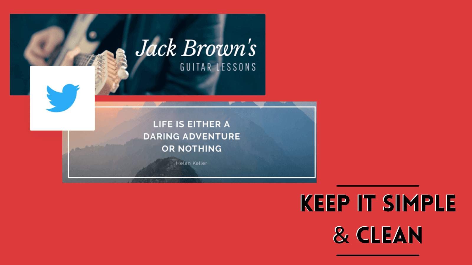
Keep It Simple and Clean
The JPEG compression can cause pictures that previously looked fantastic to behave in strange ways. It is crucial to have a sleek and clean Twitter banner that clearly communicates your marketing message while also creating interest and motivating your visitors to take action.
To reduce the aesthetic consequences of compression, keep it basic and focus on crisp lines with great contrast between text, pictures, and background colors or effects. To make your Twitter banner viewable from any device, use standard typefaces and high-contrast colors. Remember, more than 80% of Twitter users access the site using mobile devices. Thus a complex and crowded Twitter banner will not have the desired effect.
Turn Whitespace to your advantage
The first impression of your website is way more crucial than you think. And having white space or free space in your Twitter header makes it easy to direct people’s attention to what you want them to focus on: Whitespace may be used to your advantage since it denotes elegance and inventiveness. Images with a lot of white space appear clean and organized, without the cluttered appearance that makes photos look amateurish.
All the renowned brands have already learned to use this section. Their Twitter header is sleek and minimalistic. Plus, these brands leverage fun, bright colors to create a unique, thematic experience. It is an excellent technique for swiftly digesting what people see by enhancing content readability.
Apart from the Twitter header, you also need to make sure you give 100% to increase your Twitter engagement. Therefore, here’s a brief on how you can work on your Twitter engagement.
Also, check out our latest blogs:
Replacing Swipe Up Instagram Feature With Link Stickers
05 Contest Ideas To Boost Instagram Engagement For Diwali 2021
Increase Your Twitter Engagement With These 05 Tips
Interact with your customers’ Tweets-
Increase your Twitter engagement by connecting with your followers directly. Instead of constantly Tweeting and waiting for likes to pour in, why not reciprocate with likes and Retweets?
Keep your Tweets engaging-
Using engaging media content like GIFs, videos, and memes will immediately boost your organic Twitter engagement.
Know Your Peak Hours-
There will be times of day or weeks when more of your users are engaged on the site or more inclined to engage with your material. You can receive more views if you post at that hour.
Create polls on relevant topics-
Create interactive content, such as Twitter polls, to increase your Twitter engagement. Polls enable you to ask questions on relevant topics and select from a variety of responses. People may vote with a single click, making it an easy way for them to participate.
Tweet Consistently-
Consistency is something that the audience looks for in a marketer. It makes the audience believe home indulged you are towards your brand and its users. Therefore it is best to invest in tools like Socinator.
Socinator is an incredible application that gives you a variety of choices for publishing to Twitter. You may schedule your Twitter updates to fit your needs, and this is what you will need to do if you want to use Socinator to prepare a Twitter post.
1- To access your Socinator dashboard, enter your login credentials.
2- After tapping on Social in the top-right corner of the website, go to the left side of the screen and select Sociopublisher.
3- In front of you, a Publisher page will appear. Click on create a post and input your post description. You may create a campaign and then a post.
4- To add media, click Add Media, and then click Settings to modify the settings for each post.
5- Select Twitter from the list in the post options dialogue box.
6- Finally, schedule the postings according to your requirements.
That’s all there is to it when it comes to auto-scheduling postings.
So Get Ready With Your Next Twitter Header
Voila! You made it to the end. Thank you for taking the time to read this! People frequently change their Twitter header, so feel free to make new ones for different occasions, events, and seasons of the year.
Hopefully, this post answered any issues you had about designing a Twitter header/banner and gave you some tips too!
If you still have questions, please leave a comment below, and I will do my best to address them.


