“Why does my Twitter banner look blurry or cropped?” — If you’ve asked this, you’re not alone. As a social media marketer or influencer, you know that every pixel of your profile matters. Your Twitter banner is prime real estate for brand messaging, but if you ignore the correct Twitter Banner Ratio, consider your efforts to go to waste.
Poor sizing can stretch your visuals, cut off key elements, or make your profile look unprofessional. In a space where first impressions count, that’s a costly mistake. Well, worry not.
In this blog, we will clear up your confusion. You’ll learn the exact Twitter banner resolution ratio, how to design for different screens, and tips to make your header pop. So, stop guessing and start optimizing—your next lead might be just one perfect banner away.
Let’s be honest—first impressions matter a lot on social media. And your Twitter (now X) header image is one of the first things people see when they land on your profile. You risk losing credibility in seconds if it looks stretched, blurry, or awkwardly cropped. So, how do you get it right? It all starts with understanding the Twitter banner ratio and size of Twitter banner.
Before diving into design tricks and visual hacks, understand what X recommends.
In a hurry? Listen to the blog instead!
Twitter’s Official Header Image Guidelines (Yes, They Matter)
 X suggests using a header image that is 1500 pixels wide and 500 pixels tall. This Twitter banner ratio size keeps the image clear and fits well across the top of your profile.
You can upload images in JPG, PNG, or GIF formats. But here’s a quick heads-up—animated GIFs don’t work for headers or profile photos. So, stick with a static design.
Also, keep the file size under 2MB to avoid any issues during upload.
Sounds simple, right? But here’s the tricky part.
Even if you follow these Twitter banner size rules perfectly, your header image might still look off after uploading.
Why Your Banner Still Looks “Off” After Uploading?
The problem isn’t just with the social media image size—it’s with the layout. X places your profile picture right in the bottom left corner of the header image. And that profile picture moves slightly depending on the screen size.
On a desktop, the profile picture sits higher and covers more of the banner. On mobile, it moves down and covers less space. This change can hide essential parts of your design, like your logo, text, or call-to-action.
If you don’t design around this, your banner could appear cluttered or broken. And that’s a big deal, especially if you’re using it for personal branding or marketing.
Understanding the best Twitter banner ratio helps you prevent these visual mishaps.
Twitter Banner Ratio Best Practices

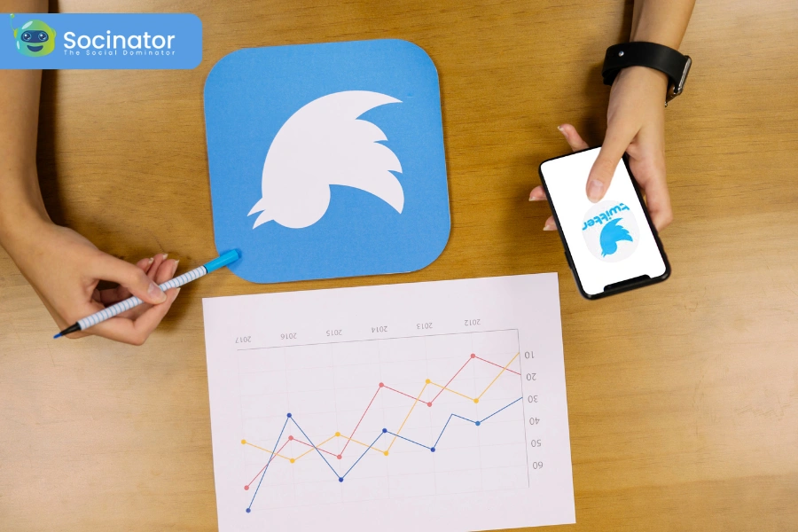
X (formerly Twitter) is more than just a social platform. It’s where brands, creators, and businesses connect with millions. Did you know that 82% of B2B brands use X for marketing? And about 75% of organizations have an active presence here.
Even better—40% of users say they’ve bought something after seeing it on X. That’s why your banner shouldn’t just look good—it should work for you.
Think of it this way: your X banner is the first thing visitors see on your profile. It can boost brand visibility, create emotional impact, and drive action. And getting the Twitter banner ratio right is the first step.
Here are the best practices for cool Twitter banner pictures-
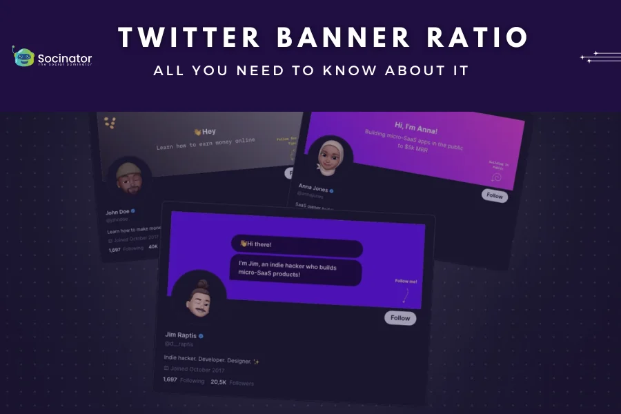
Real Brands, Real Impact
Want proof that banners influence perception? Look at brands like PlayStation and Marvel Entertainment. PlayStation uses its banner to hype up Call of Duty: Warzone. Marvel promotes the Deadpool & Wolverine movies through a bold, branded banner.
What do these banners have in common? They’re all high-quality, eye-catching, and aligned with the brand’s message. But there’s more to it than just uploading a pretty picture.
If you’re wondering, what size is a Twitter banner?—the answer is 1500 x 500 pixels. But size isn’t everything. Let’s break down what makes a banner completely effective.
Keep Your Banner On-Brand
Your banner should speak for your brand. Whether you’re promoting a launch, a campaign, or your core message—make sure it fits your voice and style. Think of your banner as visual branding real estate. It should give visitors a hint of what your brand is all about.
Pairing your X banner with the right visuals and consistent tone helps support your overall marketing strategy. It works specifically well when using a Twitter automation tool to schedule posts and keep your profile active.
Understanding the Twitter banner ratio will help you place visuals and text properly.
Make Them Feel Something
Good marketing connects emotionally. The same applies to your banner.
Pampers uses soft and emotional images that connect with their audience right away. They don’t need any words. A better picture alone can build trust, grab attention, and make people feel something.
When you plan your banner, ask: What do I want people to feel when they see this?
Your banner is a silent storyteller. Let it speak.
Clean, Simple, and Clear
You don’t have much space on an X banner. That’s why simplicity wins. Keep the design clean and your message focused. Too much text or clutter can confuse the viewer—especially on mobile.
Many brands stick to bold images and avoid text. If you must include words, keep it short. Use readable fonts and high-contrast colors to ensure clarity on all screen sizes, keeping in mind the dimensions of Twitter banner.
This matters because over 80% of people use X on their phones. The Twitter banner ratio looks a bit different on each device, so your design should adjust easily.
Place The Focus At The Center
Device differences can crop your banner in unpredictable ways. The best strategy? Follow the right Twitter banner specs and keep key elements like your product, message, or CTA centered.
Your profile image also overlaps the banner in the bottom-left corner. So don’t place anything important there. Test how your banner looks on desktop and mobile before you finalize it.
This attention to detail ensures your message never gets lost, no matter where your audience is viewing it.
Understanding the Twitter banner ratio helps you design for all screen sizes without compromising your brand’s impact.
Read More
A Complete Guide To Social Media Image Sizes
How To Use Twitter Automation Software Without Ruining Your Brand Value?
How To Design An X Header That Leaves A Strong First Impression?
 Your X header (also known as your Twitter banner) is one of the first things people see when they visit your profile. Whether you’re a business, influencer, or creator, this space offers the chance to stand out. If done right, and with the appropriate Twitter banner ratio, it can help build trust, boost awareness, and bring in new leads. Let’s look at simple steps to create a banner that reflects your brand and grabs attention.
1. Start With A Clear Idea
Begin with a brainstorming session. Think about your audience. What kind of visuals do they connect with? Make sure the image matches your brand’s tone. For example, a law firm should avoid playful cartoon designs. Instead, pick something clean and professional. Your banner should reflect the values you want people to associate with your brand.
2. Follow The Right Banner Size
Stick to the recommended Twitter banner dimensions size of 1500 x 500 pixels. Also, remember that your profile photo is 400 x 400 pixels. It can cover part of your banner. Use the safe area of about 1500 x 360 pixels to stop essential parts from getting hidden or stretched. This keeps the Twitter banner ratio looking right on all devices.
3. Highlight Time-Sensitive Messages
Have a sale, event, product launch, or campaign coming up? Use your header space to talk about it. Update your banner to showcase these timely promotions. That way, every new visitor instantly sees what’s going on with your brand.
4. Promote Your Hashtag
If your brand has a unique hashtag, consider adding it right to your Twitter header. Let your followers know how and why to use it—it’s a simple way to spark user-generated content and build an active community. Tools like Socinator can help you track hashtag performance and engagement trends, making it easier to stay connected with your audience. Just be sure your hashtag fits well within the banner ratio so it remains visible across all devices. It’s a small visual nudge that can bring long-term marketing impact.
5. Add A Personal Touch
Your banner doesn’t have to be flashy. But it must feel like you. To make it feel like your personal identity, it is essential to know the correct Twitter banner ratio. Even if you use stock photos, edit them to match your brand’s colors, fonts, and feel. Tools like Canva or help from a graphic designer can turn a simple photo into a custom brand statement and give the best Twitter banners.
6. Show Off Your Credibility
Social proof builds trust. Use your banner to highlight awards, major clients, testimonials, or certifications. If people instantly see that others trust you, they’re prone to trust you too. It adds weight to your profile and tells your story at a glance.
7. Keep The Quality High
Don’t settle for blurry or pixelated images. Your banner acts like a digital storefront. A clean, high-quality image shows you care about your brand. This sets a strong tone for visitors and keeps them interested. Cool Twitter banners always maintain clarity and consistency.
Your X header is not just for decoration—it’s a tool. By following these steps and keeping the Twitter banner aspect ratio in mind, you create something that’s good-looking and effective in attracting leads and building credibility. Need help to stay consistent with your banner strategy?
A Twitter automation tool can simplify regular updates and keep your profile fresh.
And if you’re wondering what size is a Twitter banner ratio, just remember: 1500 x 500 pixels is the ideal starting point.
Socinator- Social Media Marketing Automation Tool
 Socinator is a comprehensive social media automation tool designed to streamline and enhance your Twitter marketing efforts. By automating routine tasks, Socinator allows you to focus on crafting impactful content and engaging with your audience more effectively. It also helps ensure your profile visuals, including those that follow the correct Twitter banner ratio, align with your overall branding.
Key Features of Socinator for Twitter:
- Auto Publish Posts: Schedule and automate your tweets to maintain a consistent presence, even during off-hours.
- Performance & Account Activity Reports: Access detailed analytics to monitor your account’s performance and refine your marketing strategies.
- Auto Follow/Unfollow: Automatically follow users interested in your content to expand your reach, and unfollow inactive or irrelevant accounts to keep your feed organized.
- Auto Comment & Follow Back: Engage with your audience by automating comments on relevant tweets and following back new followers, fostering stronger connections.
- Auto Like & Unlike: Automatically like tweets within your niche to initiate new interactions, unlike content as needed to maintain a curated feed.
- Auto Reply Messages: Set up predefined responses to promptly address incoming messages, ensuring timely communication with your audience.
- Auto Retweet & Repost: This Twitter marketing tool shares relevant content by automating retweets and reposts, keeping your profile active and engaging.
- Broadcast Messages: Send essential updates or announcements to all your followers simultaneously through automated broadcast messages.
- Extract Engaged/Targeted Users & Hashtags: Identify and extract data on active users and trending hashtags to better target your marketing efforts.
- Account Management & Specific Scheduling: Customize your account settings and schedule specific actions, like changing display pictures, to maintain a dynamic profile.
By leveraging these features, Socinator empowers you to automate and optimize your Twitter marketing strategy, saving time and enhancing overall efficiency.
Before You Leave
Your Twitter banner isn’t just a background — it’s a visual handshake. Getting the Twitter banner ratio right ensures your design looks great across all devices. Whether you’re promoting a brand, a product, or your profile, your banner should reflect professionalism and clarity.
Always stick to the safe zone to avoid any part of your design getting cut off or distorted. And if you’re wondering how big is a Twitter banner, the recommended size is 1500 x 500 pixels. But designing within 1500 x 360 pixels keeps key elements visible on all screens.
Take the time to craft a banner that leaves a strong first impression. It’s often the first thing people see when they land on your profile — make it count.
Frequently Asked Questions on Twitter Banner Ratio
Q: What Does “Ratio” Mean on Twitter?
On Twitter (now called X), being “ratioed” happens when a reply to a post gets a lot more likes or engagement than the original tweet. It usually signals that many users disagree with or criticize the original post.
Q: How To Measure The Twitter Ratio?
A common way to judge a tweet’s impact is by looking at its ratio. This is calculated by dividing the number of replies by the number of likes (or favorites). It gives a quick sense of how well or poorly a tweet is being received.
Q: What is the size of the Twitter frame?
The recommended image size for Twitter is 1600 x 900 pixels, with an aspect ratio between 2:1 and 1:1 for the desktop. On mobile, supported ratios include 2:1, 3:4, and 16:9. The maximum file size is 5MB for photos and GIFs, but if you’re uploading through the Twitter website, you can go up to 15MB.